A history of Bosch product design
Crafting things of beauty
Robert Bosch was well known for his interest in modern technologies. What you might not realize is how much he valued good design in his products. To him, design meant much more than just aesthetic appeal. After all, it was instrumental in the success of his company — and remains so to this day.
New technologies — old designs
There were good reasons for this. Bosch had made a success of his company at a time of technological upheaval in the early 20th century. The advent of industrialization meant that the manufacture of individual products by hand was increasingly giving way to machine-driven mass production of identical goods. Although the products were new, their design had not been refreshed and still reflected 19th century tastes, which were an incoherent mix of different styles. This sparked a number of reform movements, chief among them the Deutscher Werkbund established in 1907.
Robert Bosch was a big supporter of this organization and gave it his financial backing as well, because he believed in its mission of enabling industrialists, craftsmen, and artists to jointly design a product and choose its material based on its function. Designers were encouraged to favor simplicity over unnecessary embellishment. Another philosophy of this movement was that good design should be a source of “moral and social renewal” in society and, as Robert Bosch put it in 1927, “promote fine and exemplary goods and designs.” The Deutscher Werkbund also pursued tangible economic objectives because its members predicted that good design would help German products take a leading position on the global market. So it’s no surprise that the 1920s saw large companies in Germany shift their focus to the aesthetics of their technology, as did Robert Bosch and his designers.
“Good design should promote fine and exemplary goods and designs.”
A better solution
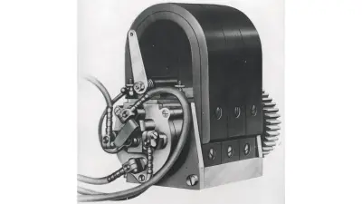
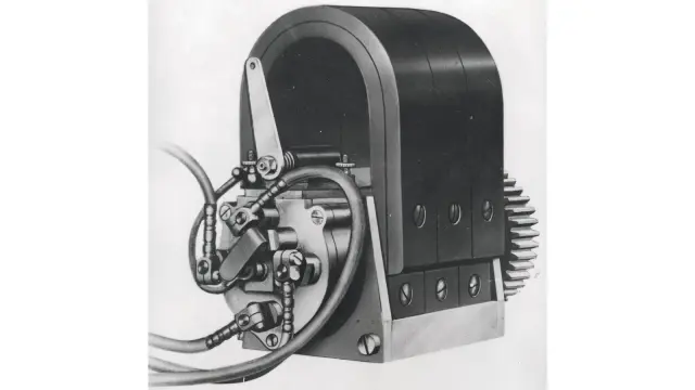
This concept also thrilled Bosch head of development Gottlob Honold. “For me, the hallmark of Bosch design is that each individual part, down to the smallest and seemingly least important one, is examined and considered in such detail in terms of the choice of raw material, shape, and dimensions that a better solution seems impossible,” he enthused in 1918. Robert Bosch had himself instructed his designers “to deliberately aim for smooth and beautiful lines in every mechanical design.” Along with ensuring technical reliability, they were now tasked with crafting elegantly shaped products.
Good design conquers the market
In the 1950s, the pursuit of a balance between elegance and functionality led to the emergence of various styles of design. In Germany, however, functional shapes reflecting the purpose and material of the product held sway. The “design industry” had long become a part of every company’s business.
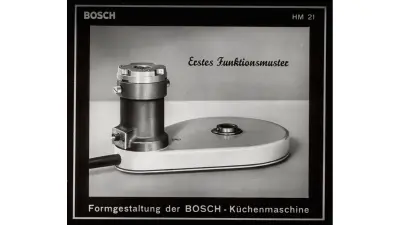
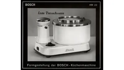
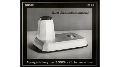
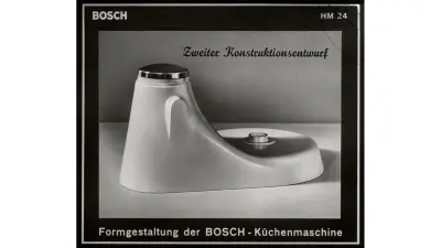
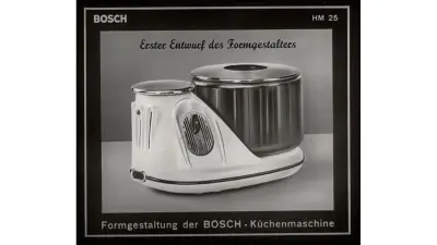
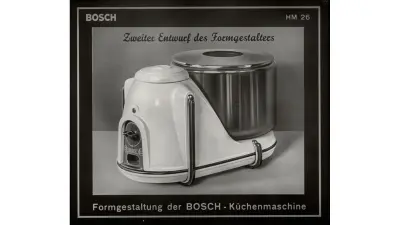
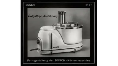
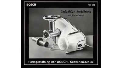
The development of the Bosch food processor from 1951 illustrates the complexity of expectations on design, which was required to express the machine’s high quality and technical reliability through attractive shapes. Designers as well as a “shape specialist” were involved in the development work. The result was impressive and rapidly conquered the market. The Bosch food processor was to become another of the products associated with the name Bosch for many years. Successful design therefore played a crucial role in defining Bosch’s image and was essential in an era of emerging mass consumption and growing competition.
The Bosch food processor
Ergonomic design
In the subsequent years, a number of product design criteria were changed, and new aspects emerged. For example, greater use was made of color effects such as dark for heavy, and bright for light.
But it was above all the rapid development of new materials and technologies that opened the door to brand new approaches to product design. The changes also encompassed the working methods themselves, with designers increasingly swapping drawing boards for computers, where they created three-dimensional objects for the first time in the 1970s.
Design specialists were in high demand and offered their services to industrial companies as well.
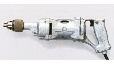
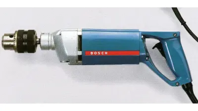
Bosch’s partnership with the designer Erich Slany beginning in the 1960s was to have a major influence on the company’s power tools. Slany designed drills using completely new materials, putting plastic casings around them. He also introduced ergonomic criteria in the design of power tools so that they were comfortable to hold.
The development of Bosch drills between the 1930s and 1960s shows the tremendous influence that new materials had on the shape, operation, and safety of these tools.
The Bosch drill
Emotional appeal
Product design became a key factor in Bosch’s success in the course of the 20th century. The company received numerous awards in this field – 500 alone between 1950 and 1980.
Today, the focus has shifted once again to new criteria. Designers are not only giving priority to sustainable materials, they also want customers to experience positive emotions and have fun using products such as e-bikes.
But regardless of what issues are currently in vogue, the goal has always been to successfully combine technology and design. The 20th century saw enormous changes in tastes, requirements, and technical possibilities. But whether today’s products are designed to be comfortable in the hand or to evoke joy, the same objective will always apply: they should all be things of beauty and quality.
Author: Vera Dendler

